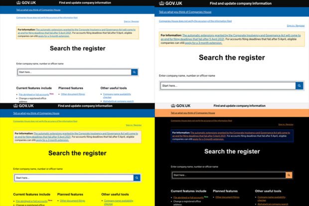
In previous blog posts I’ve written about the work we do at Companies House to make sure our services are accessible to all.
Although there’s a ‘set design’ for Companies House online services (created by my super-talented team of user-centred designers based on GOV.UK standards), did you know that as a user, you have a huge degree of control over what a webpage or website looks like for you?

Our users will sometimes ask for changes to our services to meet their individual needs: “can you make the text larger?”, “can you change the background colour?” We could, of course, react to all these individual requests, but what happens when another user asks for smaller text, or a different coloured background?
Our services are designed and built to be adaptable. You might notice this if you look at a Companies House webpage on a laptop and then look at the same page on a smartphone – the layout changes, the text size is different. It’s still the same page, but behind the scenes the webpage detects the device it’s being viewed on and adjusts itself accordingly, as if by magic!
That adaptability extends beyond which device the service is being shown on. As the user, you can adapt how an individual page, or an entire online service, looks and behaves.
Going back to the 2 examples above, let’s look at text size first.
You can change the text size in our online services to meet your needs in a variety of ways. You can do this temporarily by using some simple keyboard commands, or you could do it permanently by adjusting settings in your web browser (typically something like Google Chrome) or on your device’s operating system (that might be Windows, Android, or Mac OS). You can even change the text style (font) and text colour.
How about changing the background colour? This works in the same way. By adjusting settings in your technology, you could make the change permanent or temporary, and a change that affects one webpage, one website, or all the websites you visit.
The advantage of letting users completely customise and adapt our online services to suit their needs is that the changes they make could also be applied to other websites (if the user chooses). If a user prefers a yellow background on Companies House services, chances are they prefer yellow backgrounds on all the websites they visit. And of course, user needs may change over time.

Great – but how do you actually make these changes?
How you do that ultimately depends on your technology, mainly:
- your device
- the device’s operating system
- your web browser
So, for example I’m writing this blog on an Apple MacBook, running Mac OS, and I tend to browse the web using Google Chrome.
AbilityNet’s My Computer My Way provides simple step-by-step instructions on how to adapt your phone, computer, or tablet to meet your needs. You can search for a specific need (for example, making text larger) or filter the guides based on your symptoms (for example, hand tremors) or condition (for example, dyslexia).
If you’re not digitally confident, I would strongly recommend you ask a trusted helper to give you some assistance in trying these types of changes – if not, you might find yourself making a change that you struggle to undo.
