At Companies House we have a number of external systems for public use, like the well-known search function that allows you to follow a company’s records – which recently passed 1 million follows!
To be able to do this means we also have a lot of internal systems to process business records and other resources available externally.
As an interaction designer, designing internal services can be challenging as the ways in which the interface is used are very different internally versus externally.
Power users
One of the main differences between the use of internal and external services is we must design internal services to be used day-in, day-out by experienced staff, rather than by occasional or one-off users.
The first challenge this presents is that the current system we have was designed in a time where user experience and technology was basic in comparison to today, where the importance of user experience is far greater.
We’ve found that some internal users are used to the old system and are comfortable with the habit of using it. Even though we’ve designed a well thought out new system, it can understandably alienate some users as it’s a major leap in what they are used to.
To overcome this, we’ve implemented a few things like:
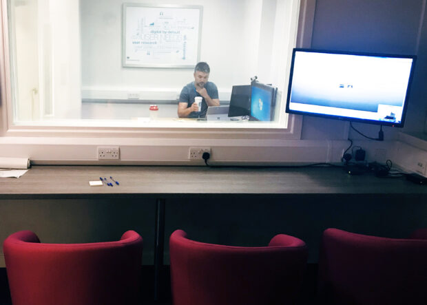
- hosting user research sessions in our user experience lab
- organising user experience workshops
- involving staff in our bi-weekly review sessions
This allows our staff members to see what the developers, designers and other team members are doing with the internal systems and feedback on what we’re doing.
By having this involvement, users pick up the new design quicker and are a key part of shaping their new software, which is important in interaction design.
Limiting choice
Another difference between internal and external systems is that instead of offering a few ways to complete a task, an internal system needs to be streamlined. When building our internal system we questioned everything that is shown to the user and worked out what is needed and what can be removed.
On the old system, the previous way was to overload all of the information onto one screen regardless of whether it was useful or relevant at the time the user saw it.
What we did to solve this issue was 2 parts.
The first was to show information that was relevant and useful at the right time in the process. And secondly, review what information was needed – if it didn’t help a staff member or serve a purpose then we removed it altogether.
We wanted to build a system that works for everyone, no matter their current experience or digital literacy skill. We wanted the new system to guide the user to the right thing at the right time, reducing the potential for mistakes.
Scalability and density
We keep external systems minimal and focused by reducing the number of actions on a page. Ideally, we aim to give a user one main action for each page.
However, when you’re building an internal system, a staff member might need multiple actions on the same page, depending on their task or set of tasks.
For example, on a case profile page you can see the overview of a case, case history and more detailed case information. Users could print documents, add comments, or take an action against the whole case.
That’s a lot of information squeezed on one page, so we had to build something new.
As no two cases are the same, we had to create a scalable system. In this instance, the information needed to stay put, so we re-organised the interface to accommodate the density of information, but also to have space for the information to grow.
To fix the issue of having lots of actions on one page we place the call to action button close to the relevant content and through the use of colour and content design we give users clear indicators of which call to actions to select based on the task they need to do.
Consistent use of language
We had a tricky situation around the labelling of an action.
During its life cycle, a user could shut down a case. However, there were multiple ways to shut a case down depending on the status. This meant there was a mixture of terminology for rejecting a case, closing a case and withdrawing a case.
As part of our role as interaction designers, we had to identify what each term meant to staff members, and whether the terminology was still correct.
We needed to adapt our mindset to match the regular users’, as what a label meant to us could mean something different to them.
Working with the content designer and through user workshops we cleared up those labels and created a more coherent and consistent use of language for the users.
Summary
In a nutshell, we treat our internal users the same as external users, in that we apply the same care and attention to the user experience and user interfaces as we would with any other system.
The way in which we design the experiences does differ though, as we are dealing with different use cases and needs.
When designing services, having an understanding of the environment also matters – if you think of your home and work environments, they’re likely quite different.
For example, at work you might have 2 monitors with your laptop connected, sitting in your office chair. But at home you might be using your tablet, on your sofa, maybe while watching the TV.
These are all factors to keep in mind when designing services for internal users.