As one of the senior interaction designers here at Companies House, my job involves the iterative design of services.
We rarely get it right first time. But through testing things with real users, we eventually end up with a service that meets the needs of our users. It’s a process of continual improvement, prototype designs, concepts and ideas.
Some of our services are really old. By today’s standards, they may contain what could be considered ‘bad’ design. But we’re not the only ones who make mistakes.
Here are some of my favourite interaction design fails in some of my favourite fictional sci-fi universes. I’m sure you’ll have your own, please add them to the comments below!
Star Trek: The Next Generation
The bridge and hallways of the Starship Enterprise are home to a bright, colourful computer interface. All diehard Trekkers know this is called LCARS.
LCARS looks beautiful, and seems to pose no problems to Picard and his loyal crew. But apart from some voice-activated functionality, it’s primarily a touch-screen interface apparently designed only for human (or humanoid) sized fingers.
What if you have no fingers? What if the Enterprise took on some sort of giant tentacle-based alien as its new helmsman? How would such a creature manage to interact with the computer with only tentacles?
Building services that everyone can use is an important part of the work we do at Companies House.
Avatar
This truly epic design fail is common to many sci-fi films: semi-transparent displays. It's seen in many of the lab sequences on Pandora, home of the Na'vi.
Yes, there’ll be scenarios where such a display might be a good thing. In advertising, maybe. Or in the form of a heads-up display (more of that later). But on a desktop office computer, it would be a nightmare.
Badly designed services put unnecessary items in front of the user, which distracts them from their goal. Auto-playing video content and pop-ups are 2 of the things that annoy me most in the real world. Now, imagine that with the added distraction of being able to see things moving behind your screen. Talk about information overload.
Star Wars
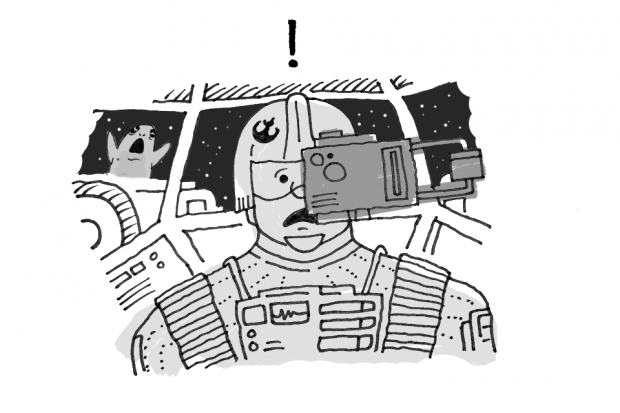
If you’re piloting your X-Wing fighter at incredible speeds on a mission to destroy an evil Empire’s Death Star, you might need the assistance of a computer to help target the thermal exhaust port.
But a targeting computer that covers one of your eyes and half your face, is probably not the cleverest use of technology. Especially at a moment when depth perception (to judge distance) could be critical. And of course, you can now no longer see anything out of one side of your X-Wing. So you’d better hope any attacking TIE-fighters are all on the side you can see out of!
My advice would be to switch off your targeting computer and use the Force. In this scenario, a transparent heads-up display would make sense.
Interaction design is often about choosing the right interface at the right time.
Alien
When designing for our users, we aim to keep things as simple as possible. ‘One thing per page’ is a guideline we try and follow. Do not overload the user!
Sometimes complex systems are unavoidable, and interfaces end up containing many elements. So it’s important that everything is clearly labelled.
Forms make up a great deal of the services we build for our users. And every form element or ‘box’ will have an associated label to tell the user how they should interact with it, like 'Name', 'Date of birth' and so on.
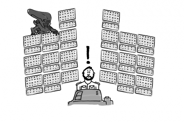
Now, imagine a system that had literally hundreds of identical elements, maybe in the form of small lights, but not a single one was labelled with its purpose. You’ve just imagined Mother, the computer mainframe on the spaceship Nostromo in the classic film Alien.
Compare that with the cockpit of a 747. It’s a similarly complex system, but everything is clearly labelled!
Jurassic Park
Sometimes I have to work under pressure, such as to meet a critical project deadline. But I’ve never had to try and accomplish an important task while genetically cloned velociraptors try and break into my office. And I pray that I never will.
If such a catastrophe did occur and I needed quick access to some critical computer files, I’d want a simple, intuitive navigation system. Not some ridiculously complicated, slow-moving, 3D monstrosity, with dozens of confusingly identical icons labelled with hard-to-read skewed text. But, that’s the exact type of system that runs Jurassic Park.
It’s no wonder John Hammond’s top-secret venture failed before it even opened. But to be fair to him, he did do the right thing and test ahead of launch. That’s how we do it at Companies House, which is why I’m happy to report that (at the time of writing) not a single one of our users has ever been eaten by a dinosaur.
So, designing something that looks cool is quite often not the same as designing something that’s usable. For government services, usability (meaning the needs of the users) should always come first. But if the interface looks cool too, then that’s a bonus!
We do not always get it right. But, by sticking to GOV.UK design standards and continual user research, we always strive to make our services better.
To keep in touch, sign up to email updates from this blog, or follow us on Twitter.


7 comments
Comment by Kim posted on
I love this post - it made me giggle on a day I really needed it! Thank you!
Comment by Alistair Musgrove posted on
Awesome scenarios. Fantastic depiction of what we often take for granted. Will be watching my favourite films a lot closer now!
Comment by Chris Wood posted on
That 747 cockpit is epic!
Good write up too!
Comment by Theo Matthews posted on
Love the Jurassic Park example. Never thought about it, but yeah, terrible UX!
Comment by Alex Mead posted on
Fun post, I laughed too, but disagree re. LCARS - its presents the information you need as the requirement arises and has very advanced AI - its a human in the loop system, which is why you only need to tap a handful of keys to accomplish seemingly complex actions. Not to mention that building adapted interfaces for those who're non-humanoid or disabled is pretty trivial when you have holodecks for prototyping and replicators for manufacture. CH can dream I suppose.
Comment by Jak posted on
Very good - loved this.
Comment by mr sticks posted on
surely the whole point of the star trek interface was it was designed for humans. Humans are the main user group. Research had been undertaken with these prospective users in mind.
And when you're aiming at something, the parallax effect from two eyes will lead to inaccurate sighting
Over to some military folks on reddit:
"The difference between these angles is parallax. Your brain uses this for depth perception and various other optical tricks that are necessary to get around the limitations built into our eyes. Like the blind spot caused by your optic nerve.
But this parallax means that you can't sight down one straight line to a target without getting conflicting data from each eye. So, by closing one eye you eliminate one angle, and can focus on just one path to the target."
although they also say in combat situations, maybe good idea to keep both eyes open, so you do have a point there je suppose